corsework
Wednesday 3rd may 2023
LO: To explore possible tasks and research similar products
1. create a front cover and a double page spread article for a health and fitness magazine aimed at an audience primarily of 14-18 year olds.


Wednesday 10th May 2023
Research
LO: To research codes and conventions of similar products

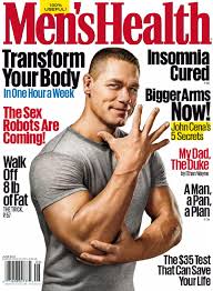
2. fitness model standing with his hands behind his back
3. The colour scheme chosen is very boring and plain white, red and black
4. it is above the mans head and is a san serif font
5. 1
6. 8
7. The bar code is at the bottom right, no issue number
8. it consists of the same font but the sizes varies
9. to catch the attention of the audience

2. Marcus Rashford
3. the colour scheme is green white and black
4. the Masthead is being covered by the mans head and its a slab serif font
5. 1
6. 6
7. there is no bar code and no issue number
8. the font varies from slab serif to sans serif
9. to catch the attention of the audience

2. there is only one image in this double page spread
3. some fonts of the writing is script to show the audience that the text is a quote
4. the text is all fitted around the main image
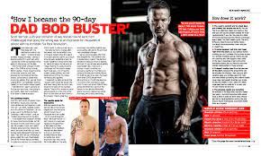
2. there are 3 images in the DPS one of them nearly filling a whole page and the other 2 are smaller and fill up about a quarter of one of the pages
3. 7 different fonts and it varies from size to font and there is also some bold text to show that the text is a title
4. the text is in columns and fitted around the main image
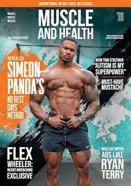
2. siemon panda is on the front cover
3. the colour scheme is blue, white, orange, and black
4.it is a sans serif font and the title is above the mans head
5. there is one big image on the cover
6. 6
7. there is no bar code and no number either
8. there are a few fonts and some of the text is larger to entice the reader into the more interesting infomation
9. to catch the attention of the audience
Wednesday 7th June 2023

1. the house style of this magazine uses blue, orange, white and black (a bright colour pallet) the font is very modern and a mixture between serif and sans serif, the main image used going againced the stereotypes of mens health magazines because stereotypically the main image would be a man without a shirt on, the layout is very stereotypical with the masthead at the top and the cover lines around the main image.
2. the production values for this magazine is mid because its not a glossy front cover and the pages inside the magazine are very thin and cheap.
3. this magazine is telling its target audience that being fit and healthy is a good thing and this magazine promotes that a lot, the target audience for this magazine is men aged 25-45.
4. the colour pallet is used to show the important of the typography for example the masthead and titles are in blue and the larger main cover lines are in white and the less important text is in black for example the other cover lines
5. the main image is getting presented well because one of the main cover lines are "Paul Rudd never gets old"
6. the target audience is man aged 25-45 and are unhealthy who want to get fit again and this appeals to them because one of the main cover lines says "get back in shape fast" also another cover line which says "for men who hate cardio"
7. you can tell that the cover and the DPS come from the same magazine because at the bottom of every page it says the masthead of the magazine also the typography is the same font as the front cover also the images is a man who has a shirt on aswell which is linking with the man at the front who also does have a shirt on.
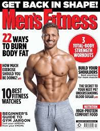
1. the colour pallet for this magazine is red, black and grey, the typography is sans serif and the layout is very stereotypical with the text located around the main image and not covering the main image. the main image is unsteryotypical because he has not got his shirt off and looking like a bodybuilder.
2. the production values are low because the front cover is not glossy and the paper feels like easily tearable paper
3.the ideologies represented are to teach the target audience how to get fit and get better endurance and build lean muscle the target audience for this magazine is about 20-35
years old and the content of the magazine link to this age of people so they can get fitter very quick.
4. the typography is used because a sans serif font is very easy to read because of the font styles used and the colour pallet is used to also make the front cover look simple and show you what is more important for example the reds are the masthead and the main cover lines and the less important cover lines are shown because they are written in black and not in bright colourful colours
5. the main image is presented very well because one of the mastheads says"Englands rugby rising star" which tells the audience that he is a rising star
6. the target audience is is 20-35 year old men and the reason that they will like to buy this magazine because they want to get fit fast and get better endurance.
7.you can tell because the font stays consistant throughout the magazine and this shows that it is from the same magazine because it makes the DPS and the front cover look the same, also the colour pallet is the same on both the front cover and the DPS's
Front cover
Style = the style needs to stay consistant throughout the magazine and must look basic to make it more stereotypical no more than 4 colour on the front cover
Typography = the typography must be serif or sans serif to match with the codes and conventions and make it look more stereotypical preferably sans serif to link with the style of the magazine
image = the image on the front cover stereotypically is a topless man who is ripped but because i'm making a fitness magazine for children then i will break this code and convention
Masthead = The masthead is always located at the top of the front cover the font is usually serif and is very large
Cover/homepage layout = is very simple with one main image in the middle of the font cover with cover lines dotted all round the main image
Content = the content of the magazine is to loose weight and eat healthier for men and how to boost your metabolism and be healthier and live longer
Colour Pallet = the colour pallet is very simple with only a few colours 2 of them usually being black and white with a different colour that will pop out.
Linked page/DPS layout = The DPS layout is stereotypically lots of text around the images.
PLANNING
Name
Teen Fitness
tagline
Looking and feeling your best
house style

FINAL MASTHEAD DESIGN

Colour Pallet
Red, white, black and hints of yellow because the codes and conventions of mens health and fitness magazines the most common colours used are red black and white and also they
cover image ideas
Teenager (male) standing up looking like he is eating an apple, medium long shot ,
possible cover lines
The best health magazine for young teenagers
The ultimate guide to getting into better shape
Weight loss training hacks for teens who hate cardio
info
age = 14-18 year old
gender = male
income/job = low paying job, part time
education = full time education in a school
interests = ambitious about getting bigger and gaining more muscle
Their friends would describe them as lean and wanting to get bigger and gain muscle
They would use social media quite often before and after school
This product will appeal to them because they will be able to gain muscle while not having to pay for weights or pay for a gym membership they can get stronger at home
DPS article subject
home workouts to gain muscle like sit ups and push ups
DPS image ideas
home workouts to gain muscle like sit ups and push ups
DPS Layout ideas
easy to understand and show lots of pictures about getting more fit at home with no weights
Wednesday 21st June 2023
Adobe illustrator
LO: Explore the use of Adobe illustrator to create a magazine masthead or logo

Wednesday 28th June 2023
Target Audience
LO:
To research our target audience to enable successful targeting
Target audience is 14-18 year olds

Cover 1
age = 30-45
gender = male
interests = business and money
class = middle class
Cover 2
age = 18-30
gender = female
interests = makeup, looking more attractive
class = middle
Cover 3
age = 30-50
gender = male
interests = rebelion
class = middle
My target audience
age = 14-18 year olds
gender = male
income/job = low paying job, part time
education = full time education in a school
interests = ambitious about getting bigger and gaining more muscle
Their friends would describe them as lean and wanting to get bigger and gain muscle
They would use social media quite often before and after school
This product will appeal to them because they will be able to gain muscle while not having to pay for weights or pay for a gym membership they can get stronger at home
Wednesday 5th July 2023
InDesign
LO: To explore and understand how to use in design for magazine layouts

Wednesday 12th July 2023

Wednesday 19th July 2023
Wednesday 6th september 2023
statement of intent

Wednesday 13th September 2023
Coursework review
LO:
To recap brief criteria and to explore how to create effective representations

1. the cover will follow the codes and conventions because the main image will be in the middle with the masthead above the main image and the cover lines will be all around the main image
2. i will have 5 images of different fruit with text written around it convincing teenagers to eat fruit and vegetables and telling them the importance of fruit and vegetables and a healthy diet
3. it will be clear because the images will be of fruit and vegetables so it will be clear that the magzine will be about health. and the magazine will be about fitness because the main image on the front cover will be a teenager flexing
TO DO LIST
1. take photos of fruit and veg and also take photos of people for the main image and anything else that
2. write the text for the dps
3. make the first draft
Wednesday 27th September
Do Now
1. The best health magazine for young teenagers
2. The ultimate guide to getting into better shape
3. Muscle made easy
4. Fitter and happier
5. burn calories fast!
Wednesday 3rd October 2023
FINAL MASTHEAD DESIGN

Wednesday 1st November 2023
Do Now
interview
recipes
how to
reviews
Article writing
LO: to create a convincing article for a teen health and fitness magazine using appropriate language, tone and representation.
headlines
written in Columbus
images
interviews
a place where the reader can read more
different font, size or colour
drop cap


1. the front cover will be olly eating a fruit to link with the DPS which will be images of fruit to link to the title of the magazine which is Teens Health
2. my article will be about eating healthy and living a healthy lifestyle by giving the reader healthy recipes for healthy food.
3. the images will be of fruit with a white background to exaggerate the colours of the fruit and make them look more appealing for teenagers. and the layout will be one bog image and smaller images around it.
4. no
5. 34 and 35
6. no i will have arial black font on the cover and on the DPS i will have a serif font
7. yes
8.
9.


RESEARCH:
ReplyDeleteGood research into conventions and strong analysis. Well done
TA PROFILE:
Basic but good
PLANNING:
A good start - which is your final masthead?
With your images - make sure you have some images of people to get that representation in